
In Color, Part II, we will discuss color grading, which is giving a specific look that enhances the mood of a scene or of the whole movie.
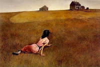
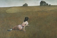
Here are two paintings by Andrew Wyeth. In one he uses warm golden tones; in the other, cooler more subdued tones. Which is preferable? To us, the answer depends on which matches the mood you are trying to convey.
In No Country For Old Men, a dark drama, the colorist created a torrid, washed-out dust-bowl, lonely and melancholy look. Mama Mia, an upbeat musical, used bright, primary, super-saturated colors. Memoirs of a Geisha used dramatic lighting, shadow and light, which was slightly underexposed to enhance the drama and gravity in each scene.

We will sometimes select a color palette and texture to emphasize the mood of a part of the wedding day. For one of our very soft-spoken sweet brides, we selected a pastel palette, with an almost watercolor feel which perfectly matched her personality.

On another occasion, as our bride descended a grand staircase, she shared some very emotional moments with her father who shed tears of joy as he saw her in her wedding gown and veil for the first time. As they waited in a dark ballroom to walk down the aisle, they looked just like the Vermeer painting on the left, Girl with a Pearl Earring. Their faces seemed to emerge from the darkness with one side deeply in shadow, the other bathed in golden late afternoon sun. Although we did not design the lighting and did not direct them to stand in a certain spot, we were able to recognize this great opportunity and put the camera in a position to capture it perfectly. So sometimes, color grading can be accomplished while filming, rather than in post-production.
Until a few years ago, color grading was relatively rare in Hollywood. But now, 95% of films are color graded. Just as with feature films, we color grade in order to create a specific mood. We feel that color grading is just part of doing the best we can for each of our clients.
Here are some interesting websites that explore color:
Color Theory - www.worqx.com/color
Fashion & Color Trends - www.fashiontrendsetter.com
Meaning of Colors - www.sibagraphics.com/colour.php


No comments:
Post a Comment